Case study
Gabiyo
Their story
-
Launched in 2020, the Hungarian-owned, domestic company provides products for people who are consciously pursuing a healthy lifestyle. It offers delicious, premium-quality granolas, jams and porridges made from natural ingredients, free of preservatives and additives, for people with any type of digestive problem or food intolerance.
The gabiyo range, which is easy to incorporate into your diet, is also gluten-free and contains no added sugar.
The cooperation
The agency's assignment involved digital marketing: writing blog articles, social media content production for Facebook and Instagram, graphic design commissions, production of decorative materials, SEO, and full digital campaign management (PPC).
The presence on a morning radio show (Balázsék), manifesting the agency's ideas, and exhibiting at the Budapest SPAR Marathon helped to raise gabiyo's awareness.
The challenge
gabiyo, as a small player in the market, found itself in huge competition. It had to make a strong mark against competitors with big names and much bigger marketing budgets to get consumers to know and like their products.
Therefore Meraki's most important task was to introduce their products to the market, and to the major stores and chains.
Meraki carefully examined the brand and the market conditions and concluded that the existing packaging was not suitable to achieve its business objectives.
Firstly, the design needed updating. The granola bags needed to be addressed, as the products inside the bags were crushed during transportation, which was a major drawback for granola. (It resulted in a powdery consistency, which seriously diminished consumer experience).
At the beginning of the planning phase, it was clear that the key was to harmonise the product range in order to strengthen the brand image and to take advantage of cross-selling.
The idea
The heart of every successful product is a good brand name.
We considered the original name GabiJó to be such, but in order to reach a younger target group and refresh the brand, we thought it was a good idea to change the spelling of the name to yo.
We also had the goal of making sellable abroad in a non-Hungarian-speaking environment not only the product, but also the brand name. The lower case, y spelling met this requirement exactly.
So GabiJó became gabiyo.
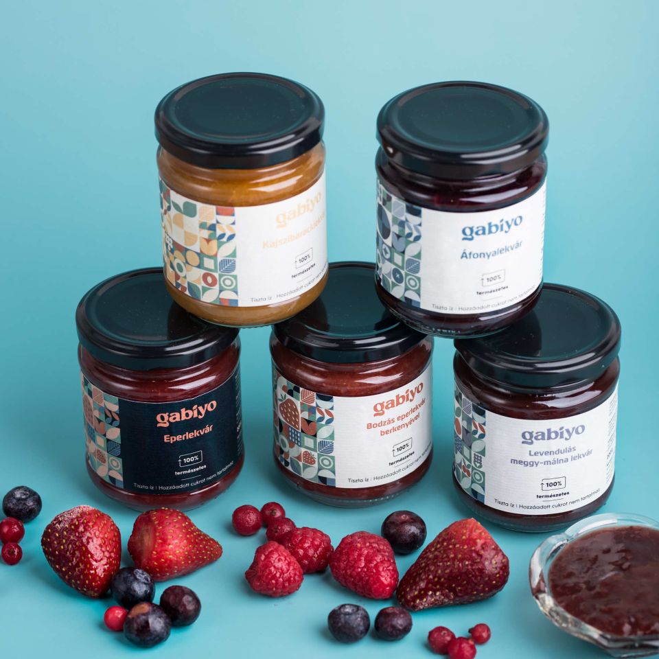
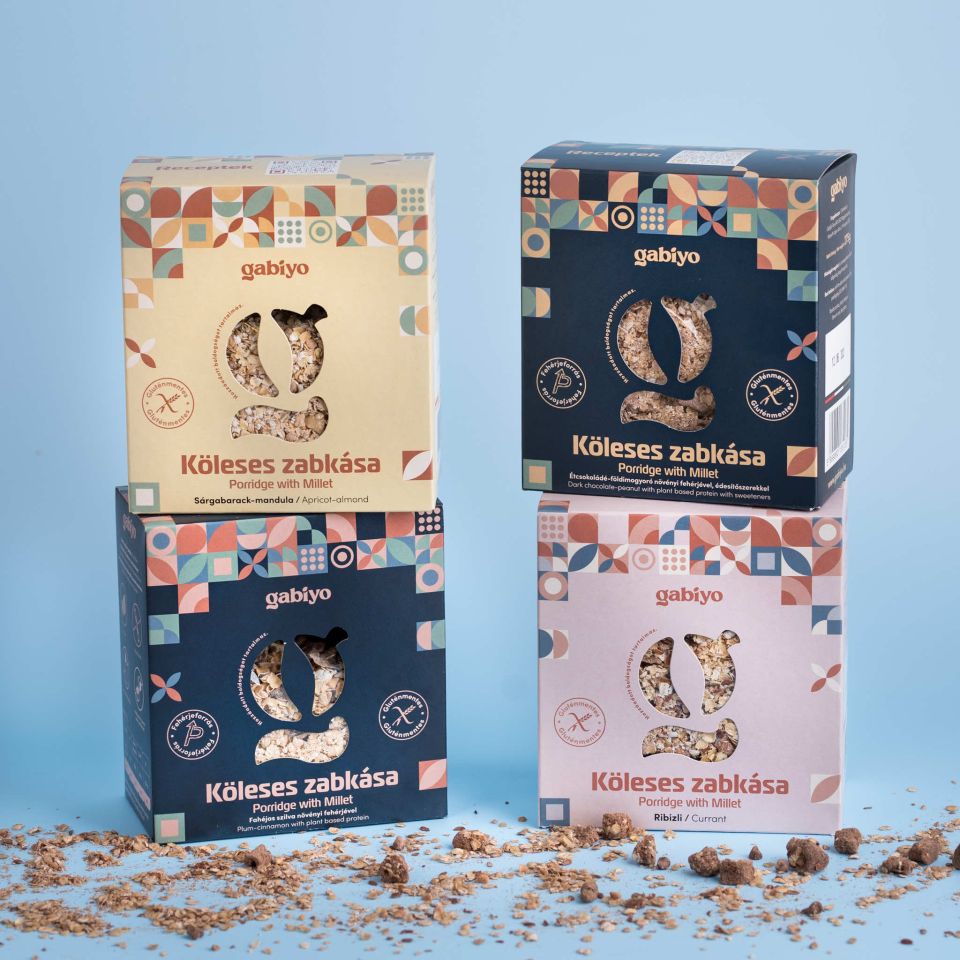
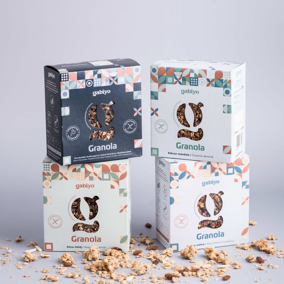
In the second phase, the products were given a new look.
The key elements of this are:
- the old range did not have a uniform look, the jams ‘stood out’ from the rest,
- the protein products were given a uniform dark look, as this was one of the USPs compared to the competition,
- environmental elements have been put on the box,
- a Hungarian flag has been displayed to reinforce the 'domestic' value,
- Hungarian and English communication was added to reinforce the brand and prepare it for possible expansion abroad,
- cutting out the letter g to show the product itself.
- and the use of pastel colours to emphasise naturalness.
But our work was not over here, far from it. In an even more exciting opportunity, the agency also asked for and was given a say in the content of the product. After a market survey Meraki suggested gabiyo omit the ingredient from products originally sweetened with stevia, which is not recommended for children, and replace it with something else.
The customer did so, and the stevia was replaced by Jerusalem artichoke puree.
Results


We created a practical, eye-catching, unified package that is different from the competition and communicates the brand effectively.
Monika Torok adds:
"Although we define ourselves as a digital marketing agency, we have a much broader area of competency than that. In the case of gabiyo, this has manifested itself in a new, clean, well thought-out packaging and a product development idea. We and the client are very happy with the end result."
The conclusion
Even if a product is ‘smart’, or in this case health-conscious, without effective, aesthetic packaging that communicates brand value, its voice is lost in the crowd.
Meraki's graphic designers are professionals who have achieved this to a high standard and to the client's satisfaction.


